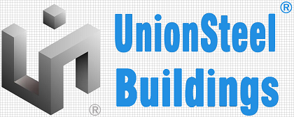
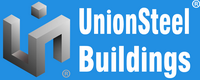
Our Logo
Union Steel Buildings’ logo has been designed to reflect the brand characteristics, confidence, recognizability and dynamism of the company. The Union Steel Buildings’ Blue color originates from the traditional color of UniBuildings, expresses the typical characteristic of a company working in steel industry: cold, strong, stable, industrial and technological. As well, blue is the color of safety, belief, peace and cooperation so it implies the willingness of Union Steel Buildings in building the close partnership with all enterprises and organizations.
Logo structure and elements
The Logo of Union Steel Buildings consists of two elements: the symbol mark and the word mark. These are fixed and should not be altered in any way. Together, they form a single unit which should always appear as shown, with each of the two elements in the same position and in the same proportion with each other. The symbol mark and the word mark must never be used individually. The word mark should never be translated nor represented in non-Latin scripts.
Colors
The logo is supplied in color variants to make sure that whatever background color or print process you are using, it will have maximum standout.
The color positive and negative logo versions use UnionSteel Buildings Corporate Blue Color: Pantone 293C. This is the preferred logo, which should be used wherever possible. The only other variant is black only, in positive and negative versions, which should be used in certain applications where use of color is limited or inappropriate.
Prefferred Logo Version(Positive) Prefferred Logo Version(Negative)
Black Logo Version(Positive) Black Logo Version(Negative)
Products Logo